
I created all of these spreads for the Wesleyan Magazine under the direction of the art director and with final approval given by the President of the University. This magazine is made up of 2 issues a year that get sent to alumni as well as one fully digital issue. Every magazine project involved a lot of collaboration and many rounds of critiques before going to print. For the story spreads, I was matched with a writer to discuss their story and possible design solutions for it. I managed about 90% of these spreads from conception until they were handed off to the art director for production.
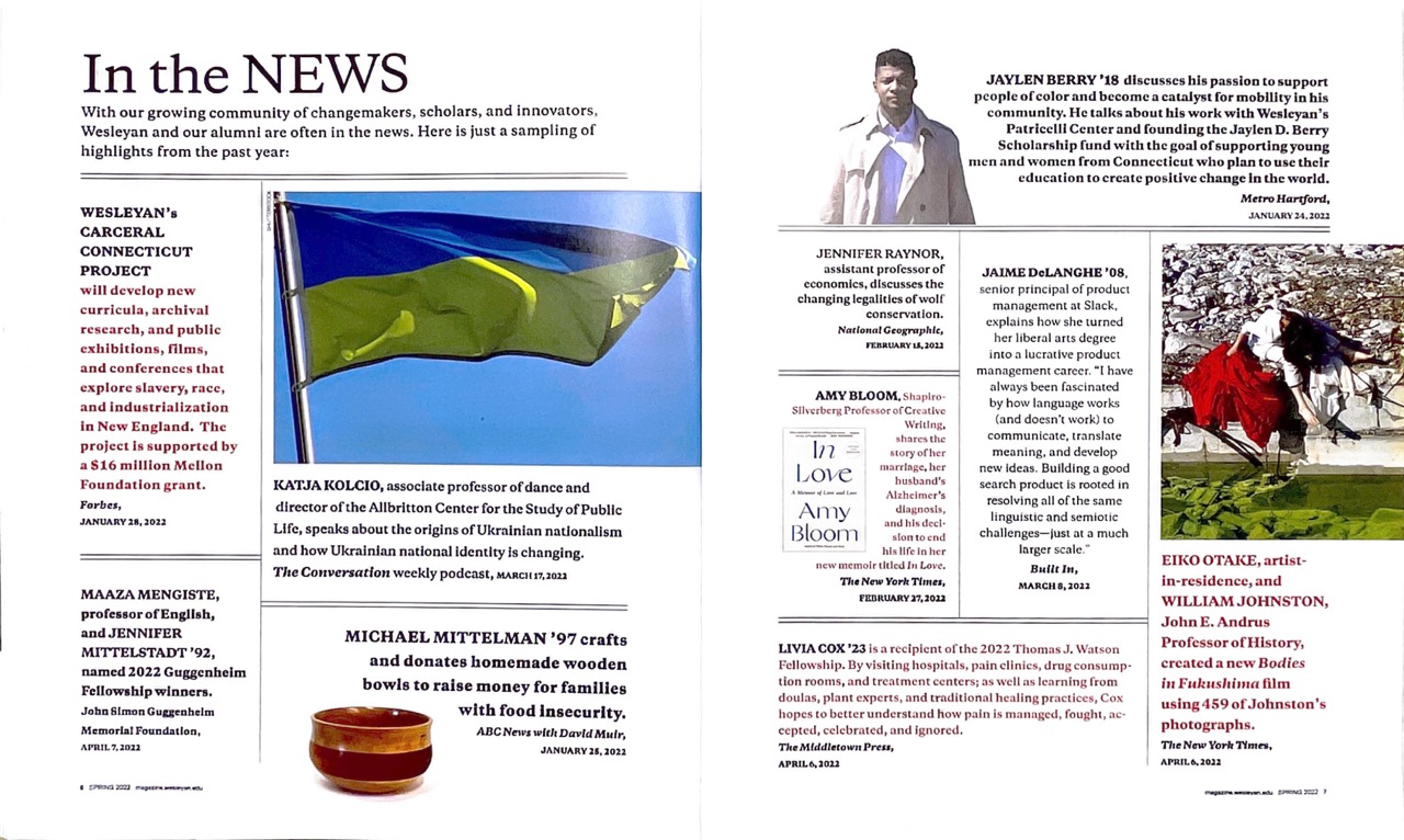
I was tasked with redesigning the magazine's In Brief section which details news and announcements from campus that have happened since the last issue was published. This is the previous design for this section which was very outdated and cluttered with each story having it's own border.
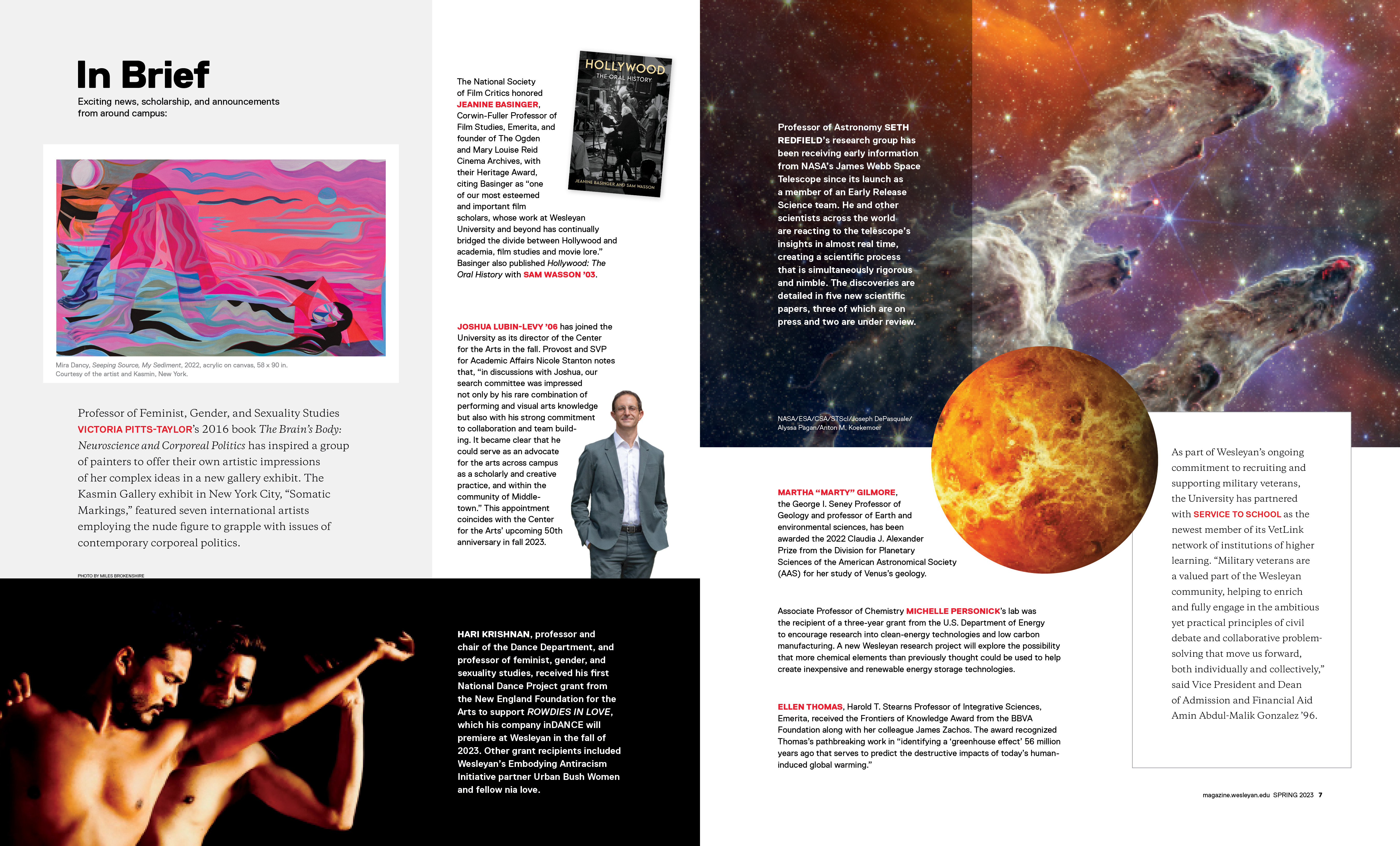
This is my first magazine spread. I redesigned this section to look more modern by reducing the clutter to make it feel more open and clean. I also increased the size of some of the photos to create more interesting focal points and give the page more of a flow that allows the eye to travel through it.

This was a new section that was being added to the end of the magazine. I was assigned to create a design for it that would reflect the look of the In Brief at the beginning and together they would bookend the magazine. I maintained the open, clean look of the In Brief and also brought in the large focal point photos.

Maintaining the new look and feel of the In Brief section with modifications to fit this issue's content.
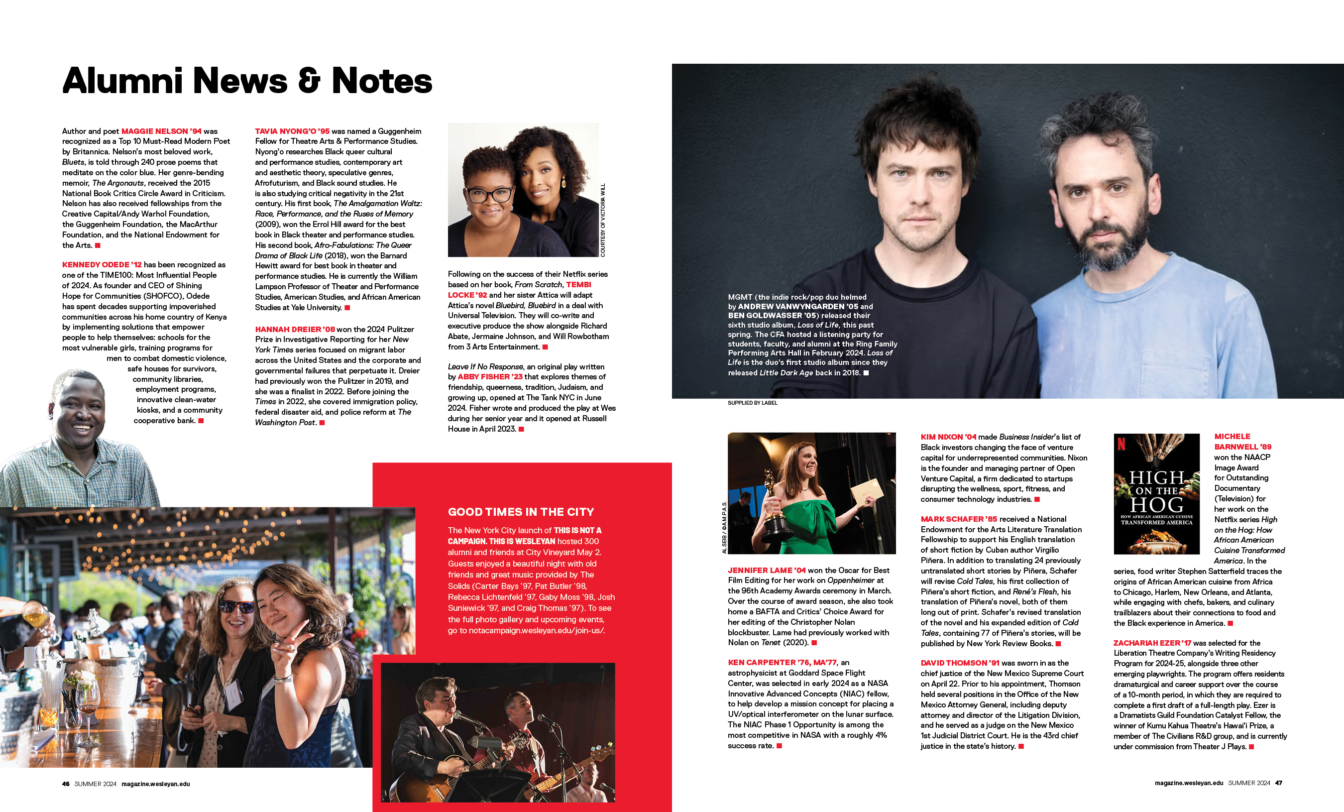
Maintaining the look and feel of the new Alumni News & Notes section with modifications to fit this issue's content.
If you like my style and want to work with me, send me an email and get in touch. I look forward to hearing from you!
Oops! Something went wrong while submitting the form :(